2 More Plotting
2.1 Getting Cute with Histograms, Boxplots, and Rugs
We have talked a bit about overlaying histograms. There’s an easy solution which is a bit inelegant, and a slightly more complicated one that is much more elegant. The latter is from here: https://stackoverflow.com/questions/3541713/how-to-plot-two-histograms-together-in-r
The simple version is to just add a second histogram to the same space as the first, using the add = T argument to hist(). We can illustrate that by first generating 500 random numbers normally distributed around 4 and make a histogram, and then generating 500 random numbers normally distributed around 6 and plotting a second histogram on top of the first one. The x limits of the first histogram have to be manually adjusted to make space for the second one that will be added (try without that to see what happens)
#make some toy data
set.seed(42) #make this repeatable
batch1 <- rnorm(500, 4)
batch2 <- rnorm(500, 6)
hist(batch1, col = "red", xlim = c(0,10)) #
hist(batch2, col = "blue", add = T) #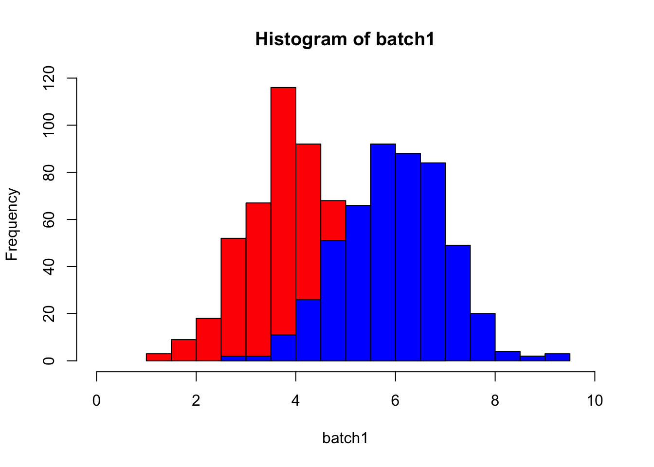
This has the disadvantage of partially obscuring the first one. This can be dealt with by making both partially transparent, which we can do by building the colors with the rgb() function. It takes four arguments: red, green, blue, and alpha, where alpha controls transparency. See below. How do you then tell which is which? Add a legend.
hist(batch1, col = rgb(0, 0, 1, .25), xlim = c(0,10),
     main = "Comparing Batch1 and Batch2",
     xlab = "")  # first histogram
hist(batch2, col = rgb(1, 0, 0, .25), add=T)  # second
legend("topright", legend = c("Batch1", "Batch2"),
       fill = c(rgb(0, 0, 1, .25), rgb(1, 0, 0, .25)))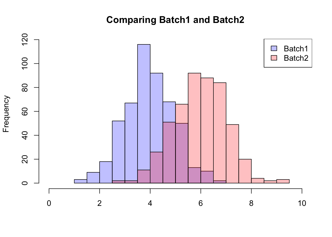
Very handy! But, as we’ve observed already, you can learn different things from different data visualizations, and often you’ll want more than one - a histogram and a boxplot, for instance. Here we’ll also add a rug plot, which illustrates every data value and really ties the whole plot together.
par(mar = c(2, 2, 1, 1)) #shrink the margins to get more plotting space

layout(matrix(c(2,1)), widths = c(1,1), heights = c(1,2))
layout.show(n=2)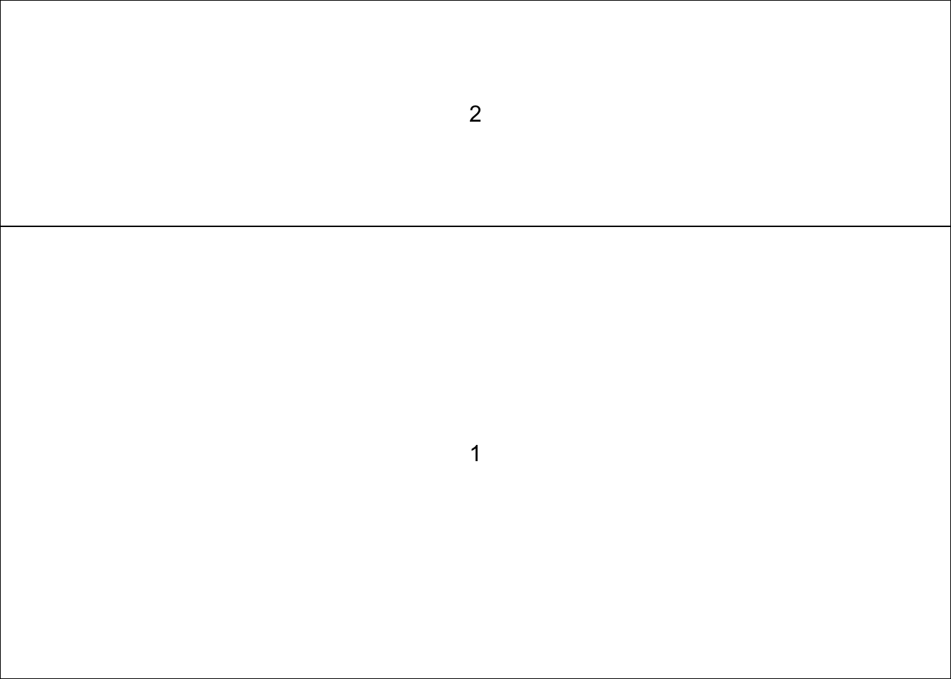
hist(batch2, xlab = "", main = "", xlim = c(0,10))
abline(v = median(batch2), col = "blue")
abline(v = median(batch2 - (IQR(batch2))/2), lty = 2, col = "blue")
abline(v = median(batch2 + (IQR(batch2))/2), lty = 2, col = "blue")
low_ext <- summary(batch2)[2] - 1.5*IQR(batch2)
high_ext <- summary(batch2)[5] + 1.5*IQR(batch2)
abline(v = low_ext, col = "blue", lty = 3)
abline(v = high_ext, col = "blue", lty = 3)

rug(batch2, side = 1)

boxplot(batch2, horizontal = T, xlab = "", ylab = "", xaxt = "n", ylim = c(0,10))
abline(v = median(batch2), col = "blue")
abline(v = median(batch2 - (IQR(batch2))/2), lty = 2, col = "blue")
abline(v = median(batch2 + (IQR(batch2))/2), lty = 2, col = "blue")
abline(v = low_ext, col = "blue", lty = 3)
abline(v = high_ext, col = "blue", lty = 3)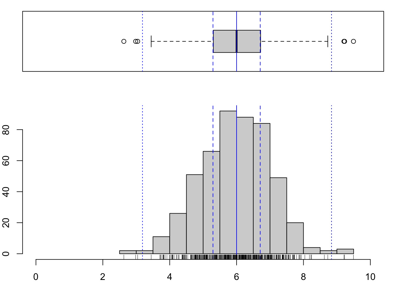
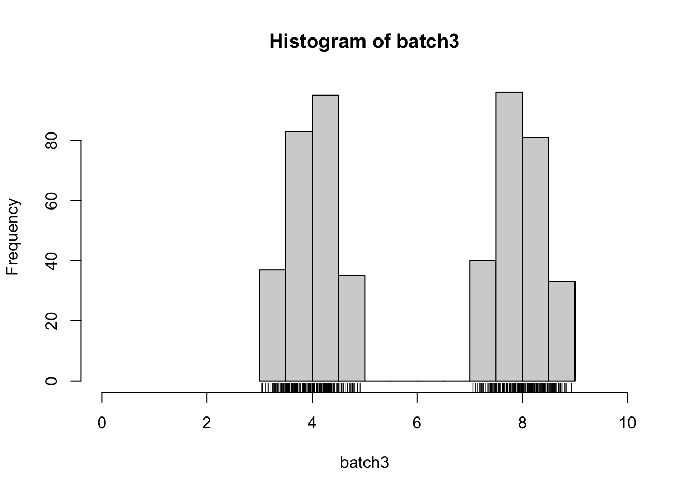
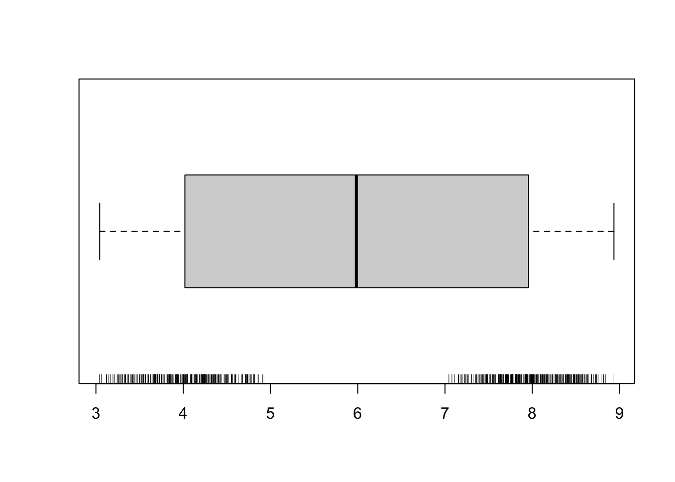
This is a handy way to examine a batch of numbers; think for instance about the different things these two plots would show you if your distribution were bimodal.
batch3 <- rbeta(500, 2, 2) #generate a batch
batch3 <- c(batch3[1:(500/2)]*2+3,
          batch3[(500/2+1):500]*2+7) #split that batch to make it bimodal
Examine with a histogram.
And with a boxplot instead.
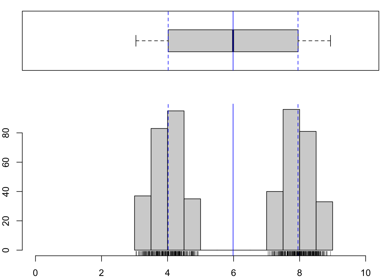
To juxtapose those plots, we could replicate the code from above, with lots of copying and pasting. If we’re only planning to do this once or twice, that’s probably the sensible approach. If instead we imagine repeating this often, we might want to write our own function. This is just like the code that we used to make a combination plot above, but instead of running each line on a given object, we specify arguments (in this case just one) that the function will take, and then detail what should be done with whatever is entered as that argument.
Here, we define a function called combplot(), which takes an argument called dataset=. Whatever is specified as dataset - in the same way that you might specify and argument to any function, e.g., mean(batch1), is pushed through the lines of code that follow.
If you run that code, you’ll see a new function appear in your Global Environment. It is stored locally instead of as part of Base R or one of your loaded packages, but you can use it in exactly the same way. In this case, since that means by specifying combplot(dataset = mydata), where ‘mydata’ is whatever vector you like.
combplot <- function(dataset){
  par(mar = c(2, 2, 1, 1)) #shrink the margins to get more plotting space
  layout(matrix(c(2,1)), widths = c(1,1), heights = c(1,2))

  hist(dataset, xlab = "", main = "", xlim = c(0,10))
  abline(v = median(dataset), col = "blue")
  abline(v = median(dataset - (IQR(dataset))/2), lty = 2, col = "blue")
  abline(v = median(dataset + (IQR(dataset))/2), lty = 2, col = "blue")
  low_ext <- summary(dataset)[2] - 1.5*IQR(dataset)
  high_ext <- summary(dataset)[5] + 1.5*IQR(dataset)
  abline(v = low_ext, col = "blue", lty = 3)
  abline(v = high_ext, col = "blue", lty = 3)

  rug(dataset, side = 1)

  boxplot(dataset, horizontal = T, xlab = "", ylab = "", xaxt = "n", ylim = c(0,10))
  abline(v = median(dataset), col = "blue")
  abline(v = median(dataset - (IQR(dataset))/2), lty = 2, col = "blue")
  abline(v = median(dataset + (IQR(dataset))/2), lty = 2, col = "blue")
  abline(v = low_ext, col = "blue", lty = 3)
  abline(v = high_ext, col = "blue", lty = 3)
}
What if you want to instead plot two batches with a cute semi-transparent overlay in both histogram and boxplot? Well…our combplot() function only can take one argument (i.e., one dataset), so you’d have to write a new function or modify this one for that.
2.2 Boxplot alternatives
Violin plots and jittered datapoints, oh my!
library(vioplot)

nanxiong <- read.delim("data/Drennan_datasets/Nanxiong.txt",
                       row.names=1)
head(nanxiong)
## Period Area
## 1 Early Bronze Age 1.8
## 2 Early Bronze Age 1.0
## 3 Early Bronze Age 1.9
## 4 Early Bronze Age 0.6
## 5 Early Bronze Age 2.3
## 6 Early Bronze Age 1.2nanxiong_EBA <- nanxiong[nanxiong$Period == "Early Bronze Age",]
nanxiong_LBA <- nanxiong[nanxiong$Period == "Late Bronze Age",]
vioplot(nanxiong_EBA$Area, nanxiong_LBA$Area, names = c("EBA", "LBA"),
ylab = "Area (ha)", col = c("lightgreen", "salmon"))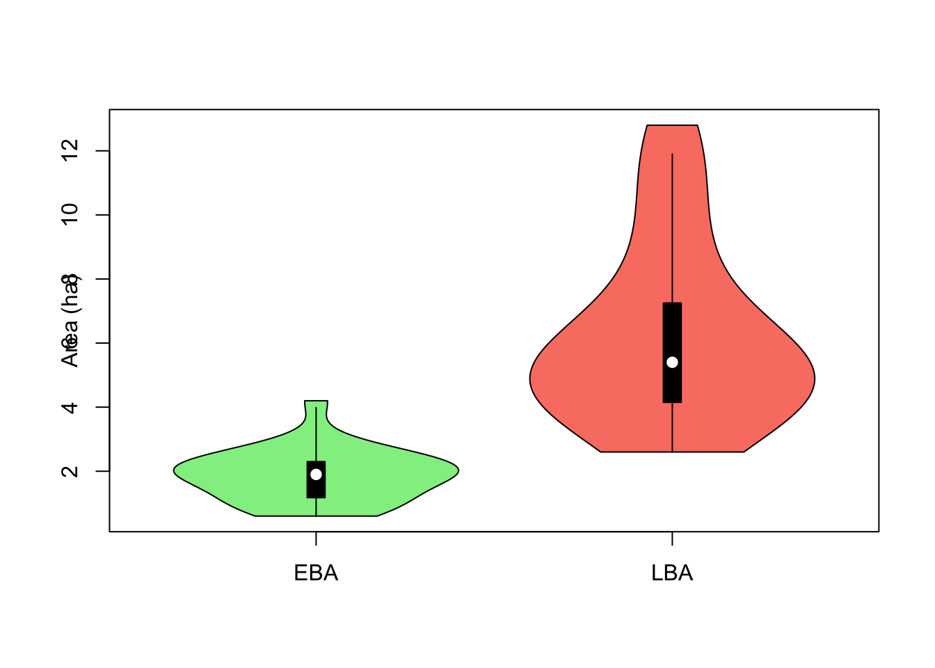
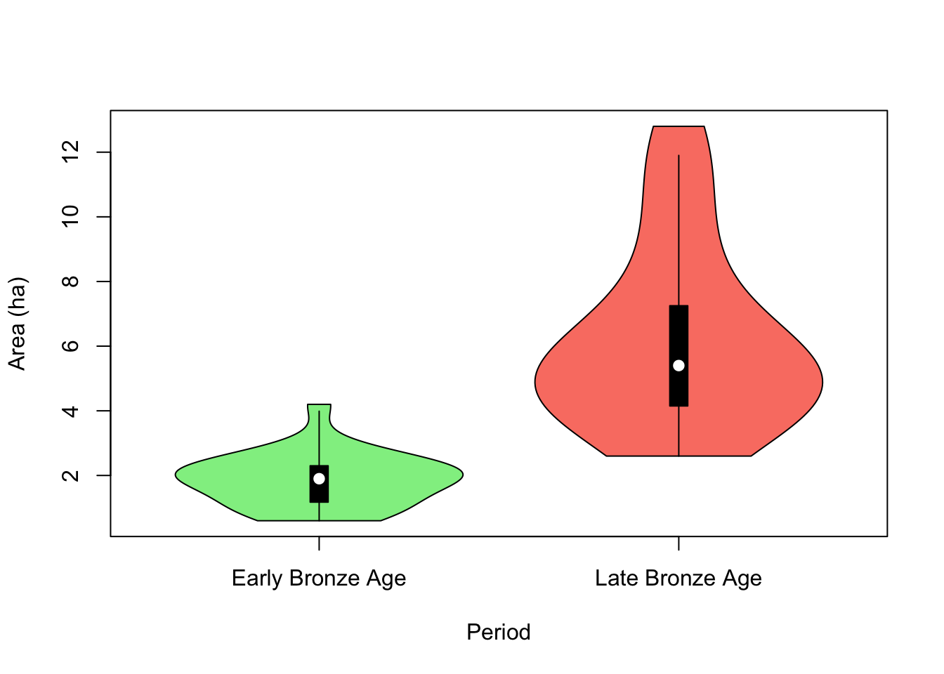
Points are overplotting…can we be cuter?
nanxiong$x <- ifelse(nanxiong$Period == "Early Bronze Age", 1, 2)

vioplot(Area ~ Period, nanxiong, ylab = "Area (ha)", col = c("lightgreen", "salmon"),
        lineCol = "grey", rectCol = NA, main = "Violin + boxplot + jittered points")
points(x = jitter(nanxiong$x, .25), y = nanxiong$Area, cex = .6,
       pch = 20, col = rgb(0,0,0,.5))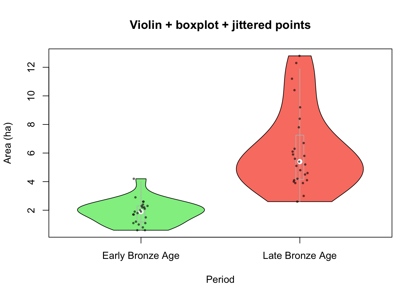
Or with ggplot (more on that below), which produces elegant plots but has idiosyncratic syntax a prescriptive approach to data; because of those I would recommend not screwing around with it until you have a firm grasp on Base R.
library(ggplot2)

ggplot(data = nanxiong, aes(x = Period, y = Area, fill = Period)) +
    geom_violin(width=1.4) +
    geom_boxplot(width=0.1, color="grey", alpha=0.2) +
    geom_point(size = .5, position = position_jitter(.1), alpha = .3) +
    theme_minimal() +
    theme(
      legend.position="none",
      plot.title = element_text(size=11)
    ) +
    labs(x = "", y = "Area (ha)", title = "Nanxiong Bronze Age Site Areas",
         subtitle = "Violin + boxplot + jittered points\n...with ggplot")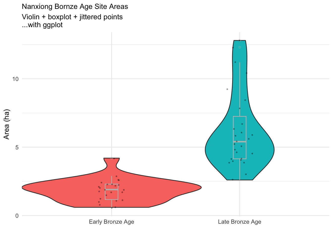
You may not always know how you might like visualize the data you have, much less how to actually implement that. You can try the R Graph Gallery for inspiration. But keep in mind that a data visualization is trying to communicate information, first and foremost, and should be selected based on how well it does that (that is, you should make lots of data plots, but be picky about the ones that you keep, and even pickier about the ones that you share, as has been recognized since well before computational tools made generating complex graphics more accessible (Cleveland 1985)). It may also be useful to consult more specifically archaeological treatments of data visualization (e.g., (Edward B. Banning 2020; Mike J. Baxter and Cool 2016); the latter is available here)
2.3 A brief and opinionated introduction to ggplot2
The ggplot2 package is widely used and can produce elegant graphics. However (in contrast to Base R, in my opinion), it’s not easy to learn, and skill in using ggplot is not easily transferable to other tasks in R.
A significant part of the problem (well, my problem, at least) with **ggplot2* is its cavalier approach to the English language. The code may be economical and lucid (this is probably beyond my capacity to judge), but the English is reliant on buzzwords and evangelical in tone (shapes are “geoms”, properties are “aesthetics”, the package uses “the grammar of graphics” [🙄]).
Consider this, from the Introduction in the manual:
a graphic maps the data to the aesthetic attributes (colour, shape, size) of geometric objects (points, lines, bars).
Translation: a data plot relates specified variables in the data to visual properties (e.g., color, shape, size) of plotted objects (e.g., points, lines, bars) that are defined by other variables.
[climbs down from soapbox]
Once you wrap your head around ggplot’s idiosyncratic approach to English, and realize that it demands more pre-processing of data than other plotting methods, it’s an efficient way to produce elegant plots. Let’s deconstruct the violin plot example from above, and then turn to putting ggplot to work with a new example.
The multiple lines below do distinct things:
- The first line calls ggplot using the
ggplot()function, then uses thedata =argument and theaes()function to define which data we are using (thenanxiongdata frame) and how we want to relate variables in that data frame to plotted objects (defined byx =andy =arguments toaes()) and visual properties (defined by thefill =argument toaes()). What’s defined in the initial call toggplot()will be inherited by all subsequent lines (linked by+).- Inheriting arguments from the initial call means that the
geom_violin()andgeom_boxplot()arguments, for instance, know what data to use (nanxiong) and what arguments toaes()to use (x = Period,y = Area,fill = Period). These can also be specified in each line. - Plot properties (x, y, color, fill, etc) are (🤷) referred to as “aesthetics”, which you “apply” to data.
- Arguments to
aesthetics(you can find a list of those accepted by any givengeomby looking at, e.g.,?geom_boxplot) that link variables to plot properties can only be made inside of a call toaes(). If they are made outside of a call toaes(), they can only be static. That is, if you want to definexas the value in thePeriodcolumn of thenanxiongdata frame, you have to useaes(x = Period), and must already have established thatdata = nanxiong. If instead you want to used a fixed value (e.g., to plot everything at the same x coordinate or in the same color), then you can specify particular values outside ofaes(). For example, you might want the fill of whatever shapes you plot to either vary according the value of the ‘Period’ variable or always be chartreuse. In the former case, you’d make an argument toaes()(aes(fill = Period)) and in the latter case you’d specify a value for ‘fill’ outside of any arguments toaes()(fill = "chartreuse"). Note that any given geom will require that some aesthetics be mapped to variables (e.g.,geom_point()hasxandyas “required aesthetics” - but this makes sense, since points are defined by x and y values and can’t exist, much less be plotted, without them).
- Inheriting arguments from the initial call means that the
- The subsequent lines are of three types: ‘geom’, ‘theme’, and ‘labs’.
- The term ‘geom’ is ggplot-speak for “shape”; each call to a
geom_()function adds a particular shape to the plot - In ggplot, ‘theme’ is a style for the plot as a whole (e.g., color of the background, font size, etc). These exist as templates, or elements can be modified individually. I use
theme_minimal()below, as I do habitually, but install the ggthemes package and uncomment theggthemes::theme_wsj()line to see what a difference a theme can make (note that these run sequentially, so if you have two lines specifying themes the second will overwrite the first). The second call totheme()sets some individual elements. - The call to
labs()specifies plot labels - title, subtitle, x and y axes, etc.
- The term ‘geom’ is ggplot-speak for “shape”; each call to a
ggplot(data = nanxiong, aes(x = Period, y = Area, fill = Period)) +  # calls ggplot
    geom_violin(width = 1.4) +
    geom_boxplot(width = 0.1, color = "grey", alpha = 0.2) +
    geom_point(size = .5, position = position_jitter(.1), alpha = .3) +
    theme_minimal() +
    # ggthemes::theme_wsj() +
    theme(
      legend.position = "none",
      plot.title = element_text(size=11)
    ) +
    labs(x = "", y = "Area (ha)", title = "Nanxiong Bronze Age Site Areas",
         subtitle = "Violin + boxplot + jittered points\n...with ggplot")
## Warning: `position_dodge()` requires non-overlapping x intervals.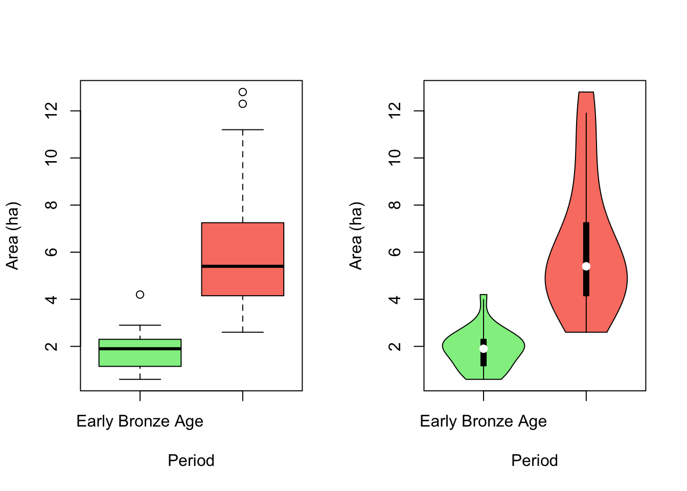
The code below is exactly equivalent, but specifies the data = and aes() arguments for each ‘geom’ rather than placing them in the initial ggplot() call having subsequent geoms inherit them. This is clearer but less efficient, and is mostly useful if you want to plot different data on the same plot.
ggplot() +  # calls ggplot
    geom_violin(data = nanxiong, aes(x = Period, y = Area, fill = Period), width=1.4) +
    geom_boxplot(data = nanxiong, aes(x = Period, y = Area, fill = Period),
                 width = 0.1, color = "chartreuse", alpha = 0.2) +
    geom_point(data = nanxiong, aes(x = Period, y = Area, fill = Period),
               size = .5, position = position_jitter(.1), alpha = .3) +
    theme_minimal() +
    theme(
      legend.position = "none",
      plot.title = element_text(size=11)
    ) +
    labs(x = "", y = "Area (ha)", title = "Nanxiong Bronze Age Site Areas",
         subtitle = "Violin + boxplot + jittered points\n...with ggplot")
## Warning: `position_dodge()` requires non-overlapping x intervals.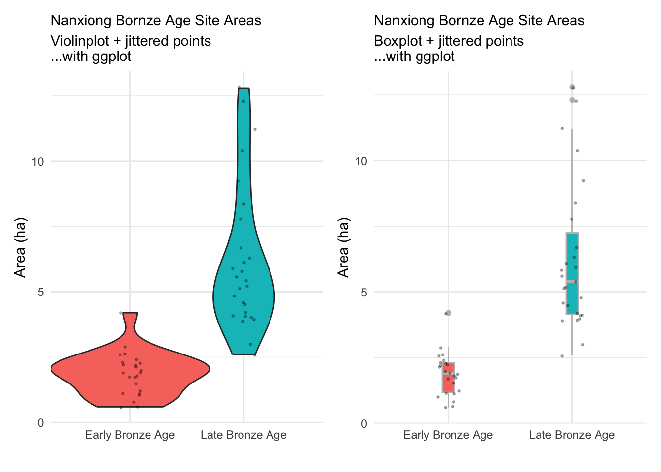
A few general thoughts about ggplot:
- If you only have a little knowledge of both base R and ggplot, it’s easier to produce elegant plots with ggplot…but harder to control them. If you know both reasonably well, you can produce elegant plots with either; for complex plots I usually turn to ggplot.
- ggplot often demands significant data preparation beforehand so that the data are in the format that ggplot expects (long rather than wide). If you’re not conversant with dplyr this will be maddening. Base R can much more easily be coaxed to plot in ways that work with existing data.
- A corollary is that manipulating a gplot plot is as likely to involve manipulating the data being plotted as it is to involve manipulating the plot directly.
- ggplot (like the tidyverse in general) tends to be pretty prescriptive. As with any template, it’s a good idea to think about what you want, and how well the template matches your desires, rather than just assuming that the ggplot defaults are a) right, and b) smarter than you are.
You can of course consult the full ggplot manual. For an example with archaeological data, see the ‘Visualizing Data’ portion of the Data Carpentry Data Analysis and Visualization in R for Archaeologists. Joe Roe’s presentation on using R for visualization of archaeological data is also focused mostly on ggplot, and very useful.